Nice Design Patterns in WordPress

I am a fan for Wordpress.

As a UI/UX designer, WordPress is one of my great sources for new ideas and patterns. When got stuck, stopping work for a while and browsing these great patterns is a great way to get new ideas. We don’t necessarily always invent new. Knowing how to use existing good design patterns is not easy, either. Actually, if one wants to become an expert in using existing patterns in right place, he/she needs a lot of practice, too.

Continue reading
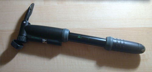
Lesson from An Air Pump: Eliminate Extra Stuff in Designs

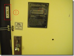
I am thinking about what challenge designers could eliminate for users when designing various products. Now as a User Experience Engineer, it’s part of my job to simplify the designs while keep good functionality as much as possible. This is a process though, since we, designers, sometimes tend to hold our ideas like babies, and do not want to give up any. However, holding too much on unnecessary components may result in frustrated users like me. And worse, they would leave and go for other similar, but better, products.

Continue reading

A Glance of 3 Real Estate Searching Sites

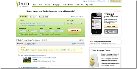
Trulia

For website users, first-glance impression might be very important, especially when there are many similar-function websites for them to use. Usually when we know we have many available and similar resources, we become somewhat critical. As Kristina Halvorson mentioned in her book Content Strategy for the Web, if users are not satisfied at first, they simply go. For websites, it is like “love at the first sight”. People may endure the interfaces at first, even if they don’t like it so much; but if it is hard to use too, they, like said above, they go immediately for other sites.

Continue reading