Paper is where ideas begin. It’s the easiest and most beautiful way to create on the new iPad. Capture your ideas as sketches, diagrams, illustrations, notes or drawings and instantly share them across the web. Download “Paper by FiftyThree” from the App Store.
Posts Tagged → design
Smashing Magazine
You should definetly visit this site, lots of useful stuff for web designers!
Responsive Web Design Offers Us
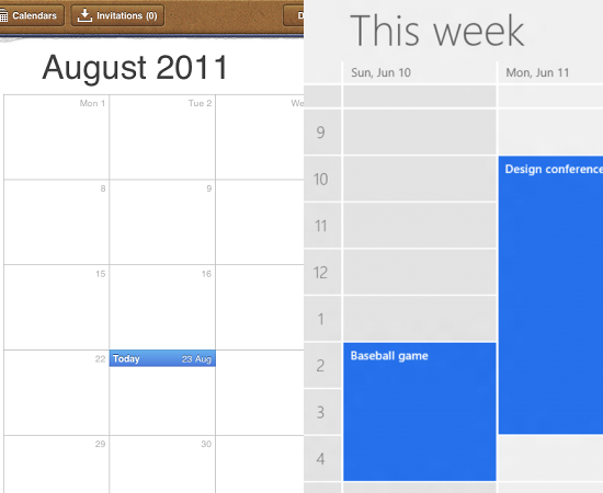
Skeuomorphic vs. Flat Design

I came across this excellent article about Apple’s highly textured and ornamented design (so-called “Skeuomorphic”) and Windows 8’s flat design. Apple tries to simulate real world objects and textures in its apps, such as iBook, Calendar, Notes; and in contrast, Microsoft tends to make interfaces look more flat and digital by removing every bit of adornment from its latest UI.
Continue readingEZ Air Dry – A Fun PVC Industrial Design Project

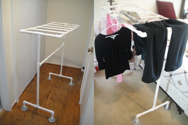
I finished another fun Coursera project: “EZ Air Dry”, a solution for hang-to-dry a fair amount of clothes in limited space. Some design topics come from the designer’s need, and this project was right the case.
Continue readingNir Eyal: Behavior Design
Nir talks about behavior design in this excellent video. He gives a nice intro to this concept and several great examples about how companies (e.g. Facebook, Pinterest, Zynga) change user habits, and what every designer should know about creating products that users love. I strongly recommend this video if you are a product owner, product manager, UI designer or UX designer like me.
Continue readingSign up for a Website: Password Field One vs. Two

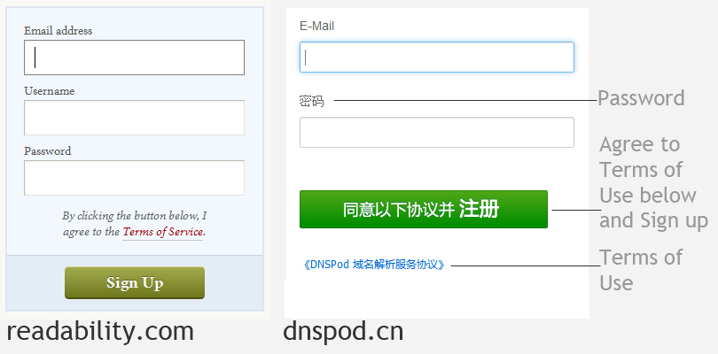
My friend showed me 2 websites sign-up pages that have one single password entry. This was my first time to see a sign-up process without re-entering password. Did some comparison with 2-password sign-up process, and it’s hard to tell right or wrong without data. Designers may have different reasons why they design something as it is, but designers are not end users. So this is when we need to have some user tests.
Continue readingHow IT Projects Really Work by Project Cartoon
I came across this awesome image quite a while ago. Most of times, people describe how projects work in words, and what I can get is just a rough impression. This image, however, just uses such a simple example and explains all!
Continue readingSteve Jobs & “One More Thing”
If Apple continues pursuing perfection relentlessly and brings us products with innovation, joy and excitement, that’s the best proof for its existence.
Continue readingVery Cool UI. Google Play.

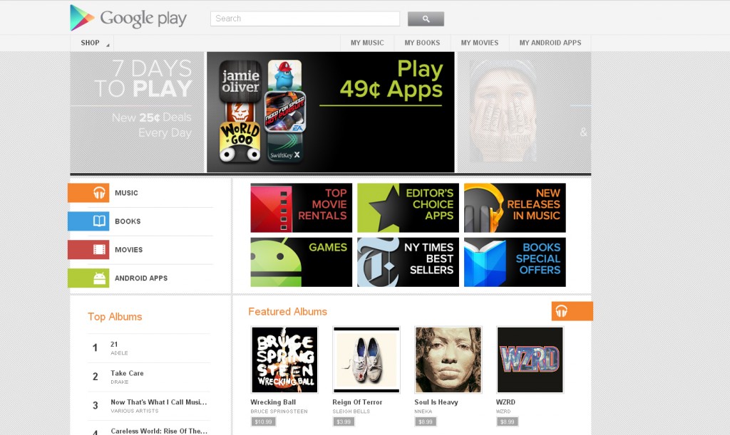
I happened to come across this page somehow. Google Play! Hey why I have never heard it before, it’s right there in Google Products page – called Google Music for now. Hmm. I had to admit that I fell in love with this visual design immediately. I like its clean, simple interface – I tried quite a few pages. Fantastic.
Continue reading