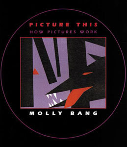
Have you ever struggled to tell a story effectively using pictures?
Think about the picture books we read when we were kids: how those vivid pictures got us involved, making us laugh or cry together with the characters. How do they make the stories so powerful?
Picture This: How Pictures Work by Molly Bang is a brilliant book to help anyone who wants to excel in picture storytelling. It tells us step by step on how to build a picture with powerful emotional message, and 10 principles that makes the storytelling better.
Following the book, here’s an exercise I’ve done to explain how it works.
The Exercise: a bird or birds attacking a victim
Instruction: create a scary picture. Use solely paper and scissors (no drawing figures in pencil first), using three colors plus white.
Molly says, before I began, I needed to think about two questions:
- What’s the essence of the creatures/things I want to represent? What elements may evoke strong feelings in me? How can I make it work?
- What feelings do I want to evoke in this picture, and what principles I might use?
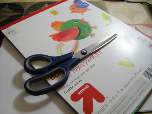
I wondered what colors were good for this scary moment. I hoped I understood the instructions correctly, and I chose four colors in total: black, brown, red and white. Then I started brainstorming:
“What about walking in dark? That’s pretty scary. ” I made black paper as the background.
“Walking… alone… in the wild.” I cut wavy roads on a hill from brown paper.
“A… lonely… man.” I cut a man from white, thinking this man is getting attacked because he looks too bright.
“And a group of scary birds… attacking him.” After random cutting, I got a group of birds, flying towards this poor guy.
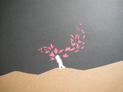
It looks a little bit scary, ok. But Molly says, “ok” is not enough, think about how to make it better. Of course, it’s hard to put everything in place effectively in my very first try; and the process of improving is the fun part.
I took some time to rethink how to make it scary. What elements should I include in the picture?
- What makes it scary? The fear in the victim. It’s not necessarily a person, any creature can have its moment of fear.
- Add more context. Where’s this victim? Place him in a place where he’s surrounded by potential danger.
- Use scary colors.
- Make triangles directional to give people a sense of movement
- Place the characters in corner, or lower half of the page makes him/her look like being threatened
- Create point shapes because they can create an uncomfortable feeling
- Group shapes by giving them similar colors
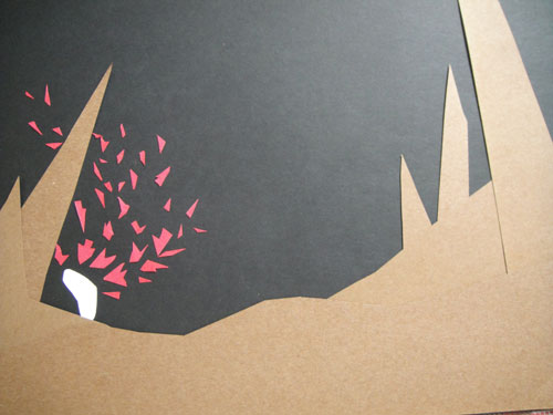
My second version was closer to “a scary image”, but the birds were kind of messy — they were not all attacking my victim. Other than that, how to make the victim even weaker?
I put more logs on the slope, made the victim smaller and triangle birds point to him. I also played with colors to get a different look and feel. How about now?
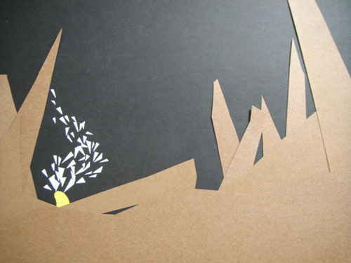
I don’t think it’s as scary as the second version. So there’s more to play with…
I hope you’re getting the idea — If you want to build a powerful picture, do the following:
- With a story in mind, ask yourself what feelings you want to evoke in your reader’s mind
- Create the first version
- Follow principles that can help you make the picture better and tweak the elements in it
- Continue to tweak the elements (relentlessly), until you feel satisfied
- Test the picture with your readers, and tweak it more
Go play with pictures! Off to continue tweaking mine now :)
Thanks Yingying! This is perfect for the talk. Even more so because they have the same title!!
Ever on-word, A.T.
Nice!!!!