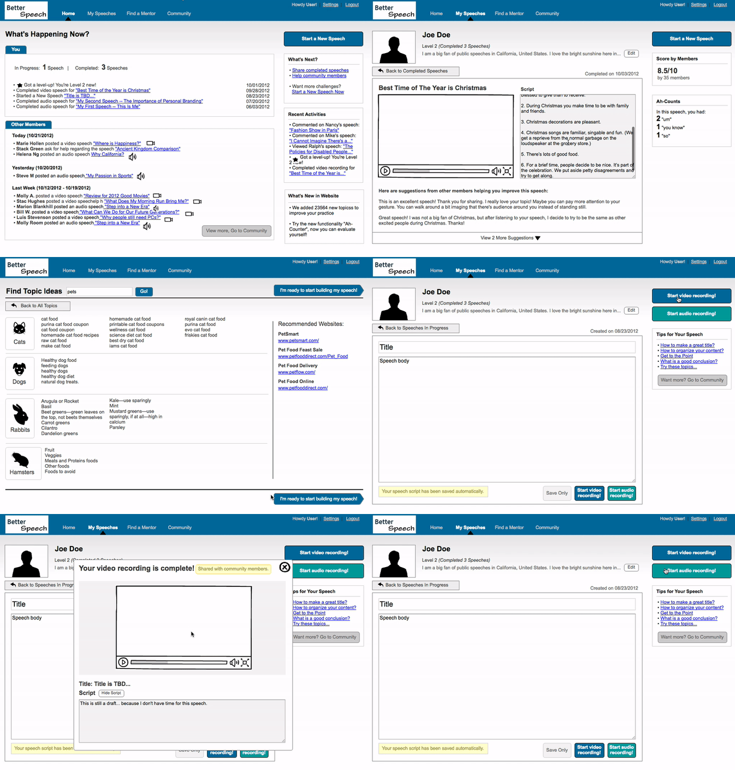
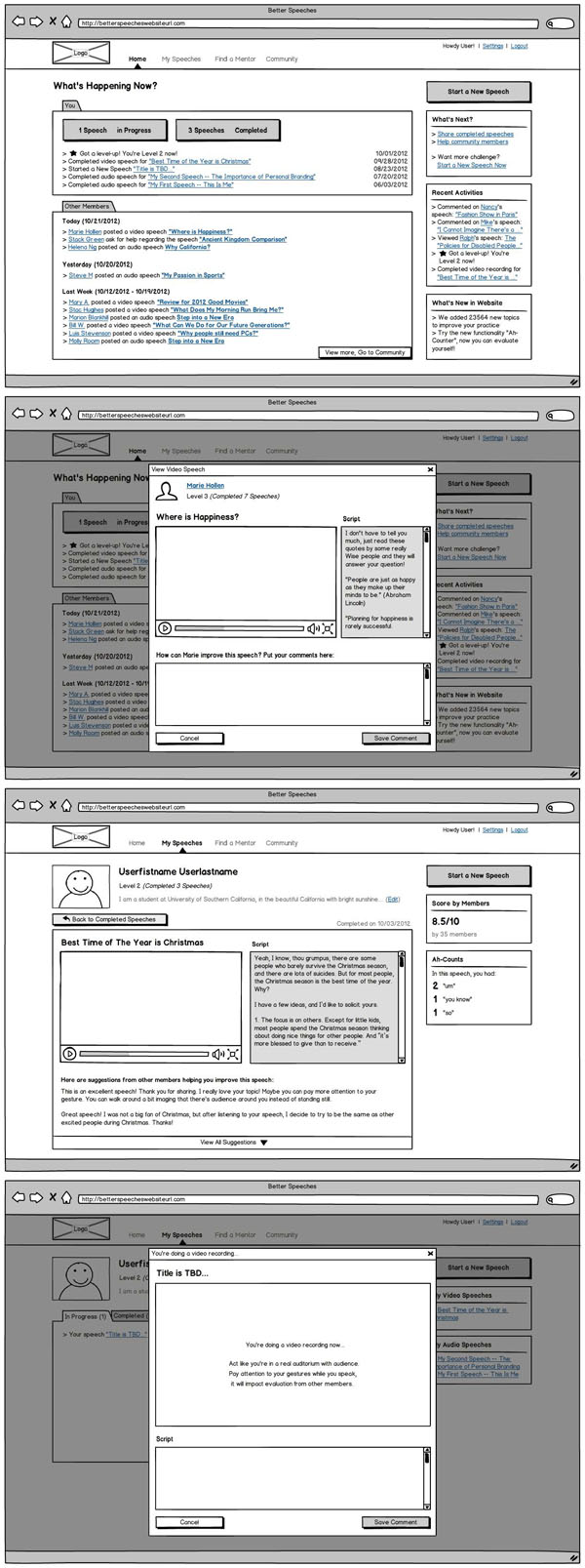
This was a project for my interaction design class from Coursera. The web app part was my homework for the class, and later I did the mobile app part just for fun. I mainly used Balsamiq and Axure. It was built in 2012.
Objective: design an online community for public speakers
Inspired by Toastmasters International, a public speaking organization that I belong to, I explored a community concept for public speaking lovers/learners to help each other improve speaking skills, online.
Web app
Created a vision
There are many places you can practice public speaking, for example, in a Toastmasters club, members gather together regularly: the scheduled speakers speak, and the assigned evaluators give them constructive feedback. However, there are times that people can not make it in person and yet still want to be able to practice for certain occasions. “BetterSpeech” community was born for this reason.
I put together some initial features that I hoped would help speakers achieve this goal:
- Create a speech
- Record video/audio speeches
- View other member’s speech video/audio and scripts, and can evaluate them right there
- View past speeches, edit speech draft and complete a speech by doing a video/audio recording
- View evaluations from other members
Storyboarding, user flows, sketches, quick prototypes
I drew out high-level stories that how this community can help users achieve these goals. Then, I sketched out user flows and explored different directions to integrate all these together into a web app that make sense to users.
I made two interactive prototypes with Axure and asked a few friends to give them a try. I got very interesting insights on how to simplify the speech creation process and adding a mentor-mentee community feature.

Finalized web wireframes and prototype & after thoughts
Based on the user feedback, I finalized wireframes and the prototype and that was all required by the class. This was the first time that I went through a product creation process: came up a product idea, went through the concept design phase and tested with users. I realized that designing for a product should not only care about how to design cool things, but also aim to build something that’s truly useful and valuable for users, as well as considering what works well for the business. Managing the balance between the users, the business and the market (and possibly more factors) is key to the success of a product.
This GIF screenshot takes some time to load. Thank you for your patience.

This is a static screenshot.

Mobilized it into an app
Mobilized it into an app
As the world moved into a mobile era (in 2012), I thought, why not make this community concept into a mobile app as well? It would be interesting to be able to record a speech and get it evaluated by others when you are traveling and not able to access a computer.
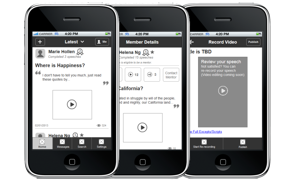
At the time, I had an iPod Touch (same screen size as iPhone 4), and thus I decided to design for this screen size.
Adjusted features, reworked navigation and info structure
To accommodate the small screen, I had to think about what can be supported and what not, at least in this first pass. I also considered what people needed to access the most (such as profile, speech history) and how to accomplish that. Based on these, I adjusted features, navigation and user flows.
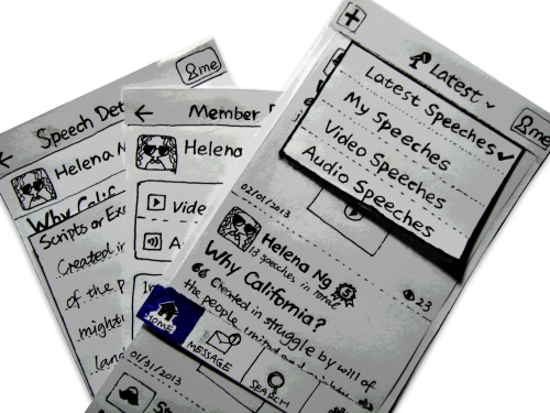
Studied iPhone UI guidelines, sketches and prototypes
I studied iPhone UI design guidelines and made sure I had a good understanding on the design standards. I did tons of sketches to explore things like pages flows and button positions, then made paper & Axure interactive prototypes and asked for opinions from my family and friends. Lastly, I nailed down the final interactions in Axure.


Demo
In order to better demonstrate what it is and how it works, I made this 4-min video (with subtitles, no sound). Enjoy!