As designers, our intuition and judgement take a big part when it comes to evaluating our own design ideas.
Sometimes, I kill ideas when they’re still in my head.
The problem with that is several fold.
Continue readingAs designers, our intuition and judgement take a big part when it comes to evaluating our own design ideas.
Sometimes, I kill ideas when they’re still in my head.
The problem with that is several fold.
Continue readingHow to expand your design explorations? How not to explore just “safe” design options?
Continue reading
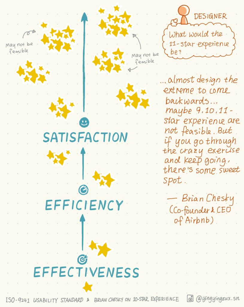
Trained academically as a computer science student, I was used to/still sometimes evaluate feasibility too early. When a solution appears, my mind starts asking “is this feasible” very quickly. That’s the downside of having an engineering mindset: you may run “feasibility evaluations” for your design solutions your head too early, rather than putting all the solution options onto the table, and waiting for your engineering partners’ expertise. This resulted in eliminating certain solutions prematurely. When you care about “what is feasible” too much too early, you stop going an extra mile to add a level of star experience for your users.
Continue reading
Even a small to-go box can reflect the “personality” and “food quality” of the restaurants.
Continue readingThere are lots of wonderful talks and meetups around the bay area, especially in SF. As UX Designers, we should go out to get new knowledge, meet other designers, hear, talk about what’s going on in the tech and design/non-design world.
Continue reading
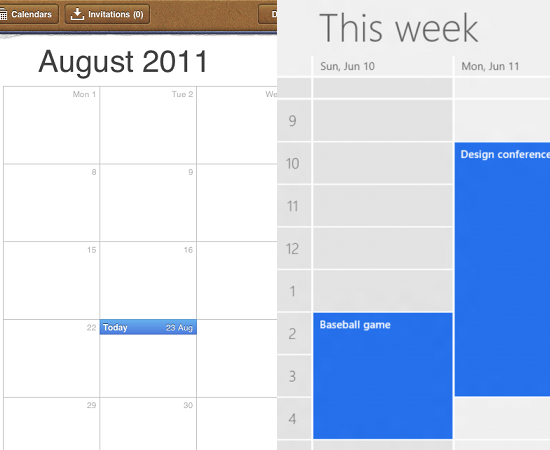
I came across this excellent article about Apple’s highly textured and ornamented design (so-called “Skeuomorphic”) and Windows 8’s flat design. Apple tries to simulate real world objects and textures in its apps, such as iBook, Calendar, Notes; and in contrast, Microsoft tends to make interfaces look more flat and digital by removing every bit of adornment from its latest UI.
Continue reading