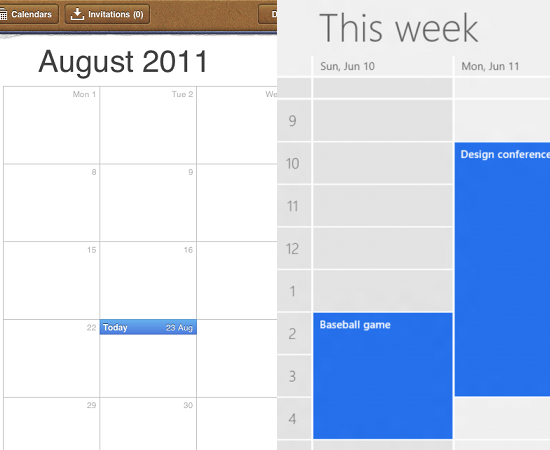
I came across this excellent article about Apple’s highly textured and ornamented design (so-called “Skeuomorphic”) and Windows 8’s flat design. Apple tries to simulate real world objects and textures in its apps, such as iBook, Calendar, Notes; and in contrast, Microsoft tends to make interfaces look more flat and digital by removing every bit of adornment from its latest UI.
Continue readingPost Category → Creativity • Products • Designs
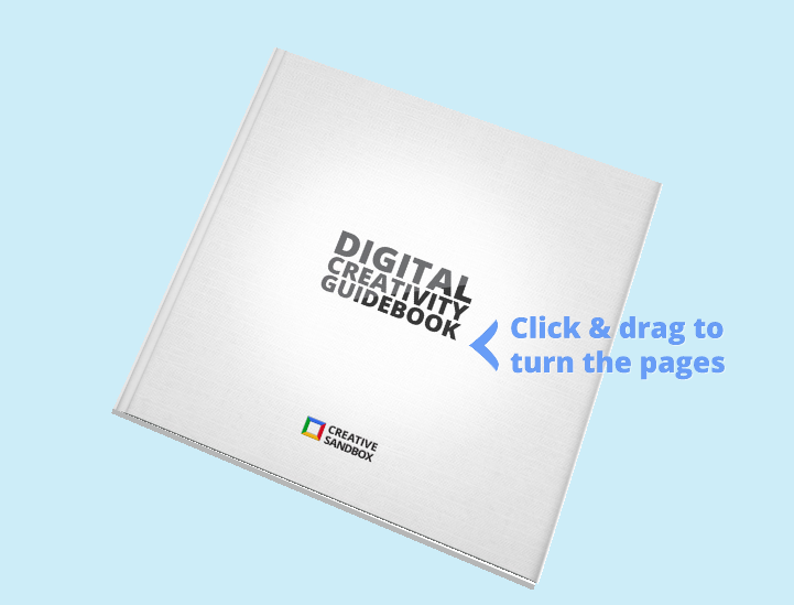
Creative Sandbox Guidebook: WOOOOOOOOW!
This is a guidebook from Google Creative Sandbox, and WOW! Completely amazed by it.
Continue readingCreativity! – iPad & iPod Magic
There are always something that impresses me and makes me moved, especially when it’s full of imagination and creativity. In the two videos below, you can see how amazing when creativity flows.
Continue readingNir Eyal: Behavior Design
Nir talks about behavior design in this excellent video. He gives a nice intro to this concept and several great examples about how companies (e.g. Facebook, Pinterest, Zynga) change user habits, and what every designer should know about creating products that users love. I strongly recommend this video if you are a product owner, product manager, UI designer or UX designer like me.
Continue readingVery Cool UI. Google Play.
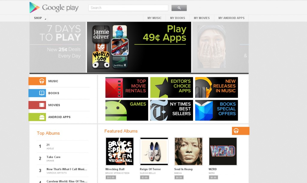
I happened to come across this page somehow. Google Play! Hey why I have never heard it before, it’s right there in Google Products page – called Google Music for now. Hmm. I had to admit that I fell in love with this visual design immediately. I like its clean, simple interface – I tried quite a few pages. Fantastic.
Continue readingNice Design Patterns in WordPress
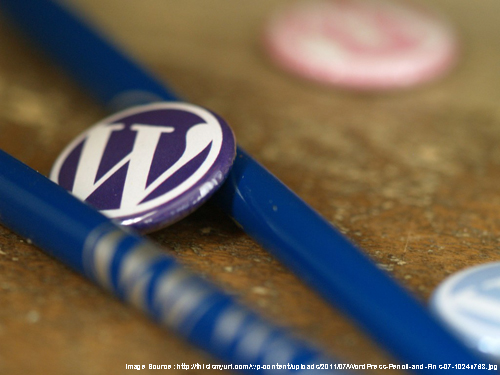
I am a fan for Wordpress.
As a UI/UX designer, WordPress is one of my great sources for new ideas and patterns. When got stuck, stopping work for a while and browsing these great patterns is a great way to get new ideas. We don’t necessarily always invent new. Knowing how to use existing good design patterns is not easy, either. Actually, if one wants to become an expert in using existing patterns in right place, he/she needs a lot of practice, too.
Continue readingFrom Designers to All Clients…
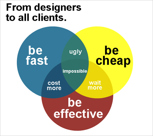
There seems to be arguments between designers and clients always. Well, then how about make a poster clearly state the designers’ opinions, haha:)
Continue readingLesson from An Air Pump: Eliminate Extra Stuff in Designs
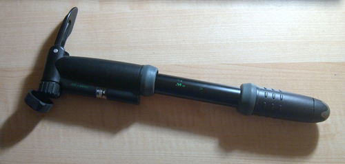
I am thinking about what challenge designers could eliminate for users when designing various products. Now as a User Experience Engineer, it’s part of my job to simplify the designs while keep good functionality as much as possible. This is a process though, since we, designers, sometimes tend to hold our ideas like babies, and do not want to give up any. However, holding too much on unnecessary components may result in frustrated users like me. And worse, they would leave and go for other similar, but better, products.
Continue readingFiction or Future? A Day Made of Glass from Corning
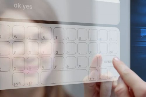
I’m totally impressed by this video A Day Made of Glass from Corning. I believe Corning again presents powerful ideas on glass to the world, and for us, it sparks endless imagination about the future world.
Continue readingNoteslate – Simplest & Most Exciting Tablet!
NoteSlate is a monochrome tablet device, all we need to do is to sketch whatever we like on it!!
Continue reading