For website users, first-glance impression might be very important, especially when there are many similar-function websites for them to use. Usually when we know we have many available and similar resources, we become somewhat critical. As Kristina Halvorson mentioned in her book Content Strategy for the Web, if users are not satisfied at first, they simply go. For websites, it is like “love at the first sight”. People may endure the interfaces at first, even if they don’t like it so much; but if it is hard to use too, they, like said above, they go immediately for other sites.
Continue readingAuthor Archives → yingying

Tab Play Project – Amazing Google Chrome Ads (Japan)
A video advertisement for Google Chrome browser. It’s successful, making people attracted, stay and praise, at least I would like to give it a loud applause. What do you think?
Continue readingObservation and Thoughts for A Hotel Room Design
I was pretty disappointed with the hotel room design when I was in Florida. It’s ok to be plain, but please make it easy to use first (e.g. make it easier for me to open the bathroom door).
Continue readingGo-Trip! — Android Traveling App Demo Video
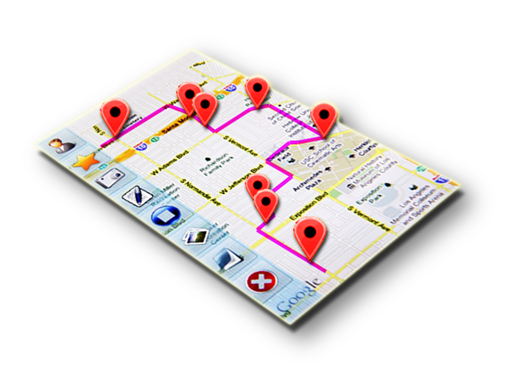
Go-Trip!, a traveling app based on Android 2.2 platform, was developed by our 6-person team in Fall 2010. I was the UI Designer and Video Demo Director :)
Continue readingTwo Traveling Websites – Simple Analysis (2)
Another simple analysis for a travelling site.
Continue readingTwo Traveling Websites – Simple Analysis (1)
An usability analysis about a travelling website, and how to make it better.
Continue reading