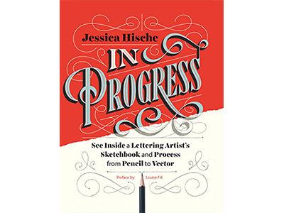
This book came to me as a Christmas gift from my Secret Santa in our company’s gift exchange.
It’s about lettering. Jessica Hische, the author, is an expert in lettering. She has gone through a winding journey discovering her interest in arts, working hard to find her way into lettering, and now shares her journey, knowledge and experience through this book.
I can’t wait to read it. Finished it up on Christmas Eve.
I haven’t worked on lettering enough to be able to tell whether I’m into it or not. But, I really enjoy her pieces of wisdom on work ethics, processes and tactics throughout the book. I read it with a pencil and lined words, phrases and sentences I loved. Needless to say, I made lots of lines.
Below are some of them that I loved from this book:
The work was addictive, and I couldn’t get enough. When projects called for one poster, I made five. I took every opportunity to push projects further… I would pay attention to which parts of projects I was devoting the most time to (which parts was procrastiworking on) and would take note, knowing that each of those moments might be another burst along my career constellation.
Letterers can break all the rules if they wish — they can defy pen and brush logic and make crazy, zany letterforms not grounded in tradition— but, like many people have said before, you have to know the rules to know how to break them. If you understand calligraphy, you are better at critiquing your own lettering work. When something doesn’t look quite right, you understand how to fix it.
It’ tempting to jump onto a computer before taking time to actually figure out what it is you want to make, but I’ve found that doing so always leads to frustration, boring ideas, and a sameness to your work.
You might fall in love with a fancy bit of vintage lettering on Pinterest, but it won’t be an apropos starting point for every project.
Visual research is something that should be a part of your day-to-day life, not just something that you do at the start of a project. Be a sponge; absorb everything around you.
I highly recommend that when you have to do this kind of research you make sure you leave a bit of buffer between your time spent researching and your time spent brainstorming. I notice that when I try to cram both processes into the same work session, all the information I’ve taken in through research hasn’t had enough time to settle in my mind. I end up accidentally ripping off my source material or being too literal with my concepts. – Jessica on Research and Brainstorming
Sometimes “obvious” works conceptually, but usually I try to dig a little deeper.
Deciding on a lettering style or styles can be difficult if you’re constantly envisioning the end result instead of making small decisions as you go.
When I’m sending sketches to clients, there are three distinct sketches with different ideas and layouts explored in each (not three micro variations on one sketch). Clients want to see that you are using your brain and really diving into the material, not just doing the first thing that comes to mind.
Whenever a letter looks a little funky, ask yourself, “Am I following pen logic, or did I accidentally invert the contrast?” When you defy pen logic, make sure it looks purposeful and not accidental.
Mistakes can be beautiful if they’re made consistently — always looking as if they were made on purpose and not by accident.
Make sure that the swashes feel as if they were drawn with the same writing implement as the letterform itself unless you can draw them drastically different in a way that seems obvious and intentional.
If you break the rules, have a reason for it.
Color is so powerful and so subjective that if I colorized my sketches, the client would, without a doubt, gravitate toward the version in the color palette they like the most, even if they liked the design or letterforms the least.