I happened to come across this page somehow. Google Play! Hey why I have never heard it before, it’s right there in Google Products page – called Google Music for now. Hmm. I had to admit that I fell in love with this visual design immediately. I like its clean, simple interface – I tried quite a few pages. Fantastic.
I think this is the design trend for future Google (since Gmail redesign) and I am a fan of it. For Gmail though, the new redesign has some issues when your screen is too small – the email will become compact view and it’s really crowded; and the new scroll bar and email body width become crazy sometimes. I hope they can do some fixes soon, but in general I do like the new look, and I think the way of designing buttons on top of email entries is indeed smart.
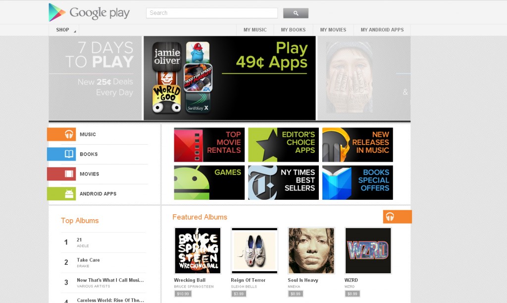
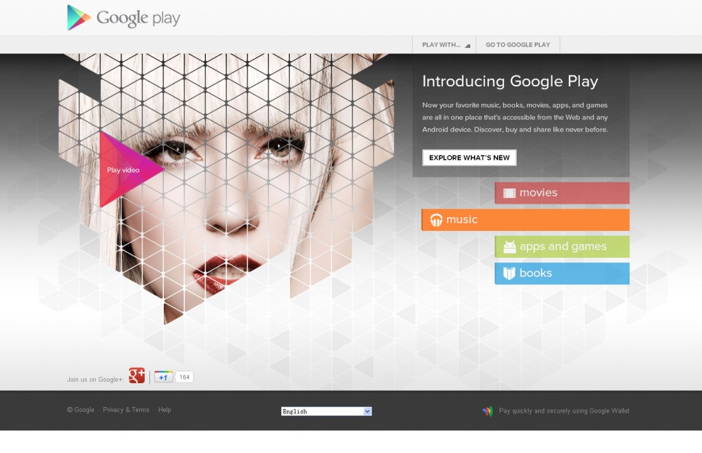
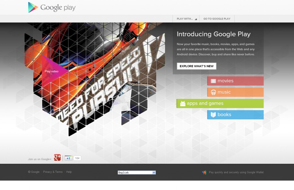
Ok back to Google Play. Actually when I got to its about page and I just stopped there. I bet I was smiling like a idiot when I was looking at the cool About page. I’ll share some screenshots with you (click image to enlarge):
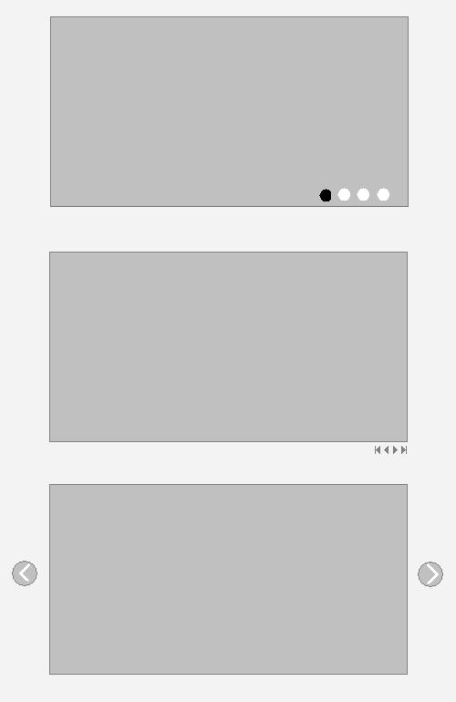
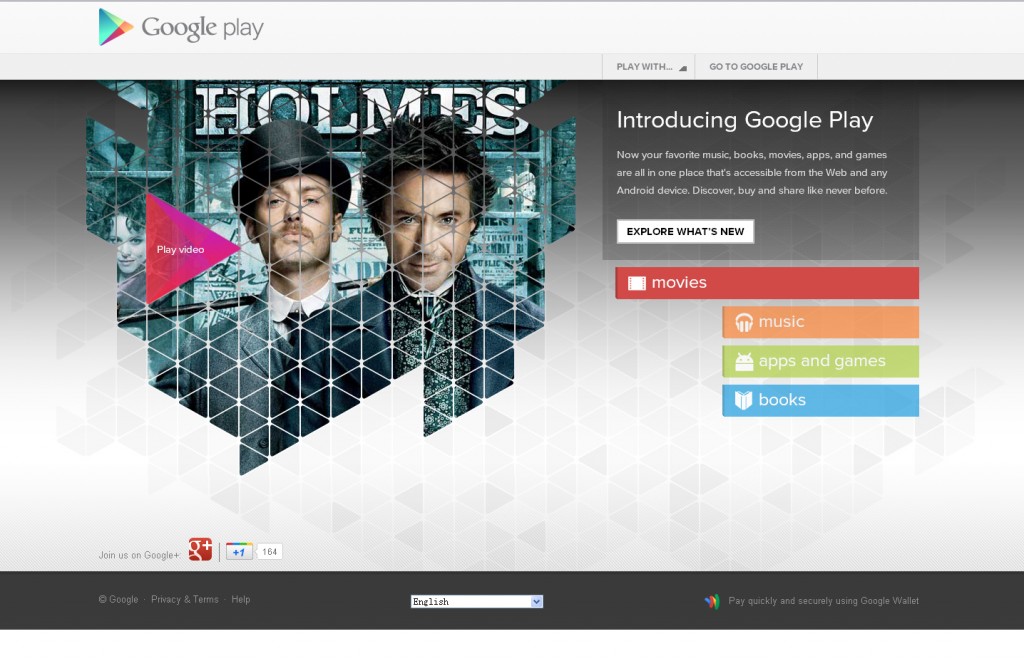
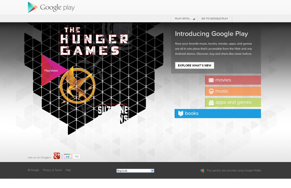 I love this interface mainly because of its design for slideshow. The “movies”, “music”, “apps and games” and “books” are actually buttons as well as slideshow navigation. And the left part is the irregular-shaped & cool slideshow. If Google Play uses one of the following common slideshow shapes, it won’t look so good:
The other reason I like it because it merges the functionality of button & navigation, so this saves screen space and eye efforts. Maybe this is what I will try in my future work.
Really cool。