My trip to Florida this November really gave me a strong feeling of calling for good hotel room designs.
I lived in a Hotel called Rosen Inn, and I was shocked about the room design. It was so inconvenient that I took some photos for records.
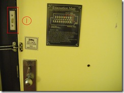
After opened the door, I was eager to step into the room and throw my heavy suitcase onto the ground. However, where was the switch? I felt so insecure in the room if I didn’t let the lights on first. I searched everywhere on the wall and finally found the switch among a lot of other stuff. It was an extremely small switch, even hard to see in the picture below (see the thing circled). I spent 1 or 2 minutes looking for it. I think this was one reason that my impression for this hotel leveled down a bit.
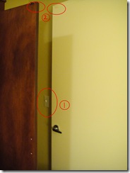
The switch problem happened again when I was looking for the bathroom. I felt bad when I was in a hurry to use it and could not find the right place to turn on the lights.
Also I found a conflict with the bathroom door and closet door. The problem is that if the closet door is open, the bathroom door will always have a crash with it when opens. They are too close.
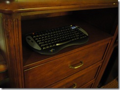
Umm.. what is this? Yea, it’s a keyboard, so maybe there was a computer somewhere for me to use in the room. However, wrong, it seemed this keyboad was for the Television. My roommates and I observed it for a while and finally we decided to use the keys on the sides of TV, not even to bother to use this keyboard. We were users, not researchers for the new device.
In all, this room was a small dissatisfaction during my great trip. I think designers will need to always pay attention to users – what designs are comfortable for general users? Who are the target users and how to improve designs towards them? Only think from the users’ perspectives, designs would become exciting and enjoyable.


